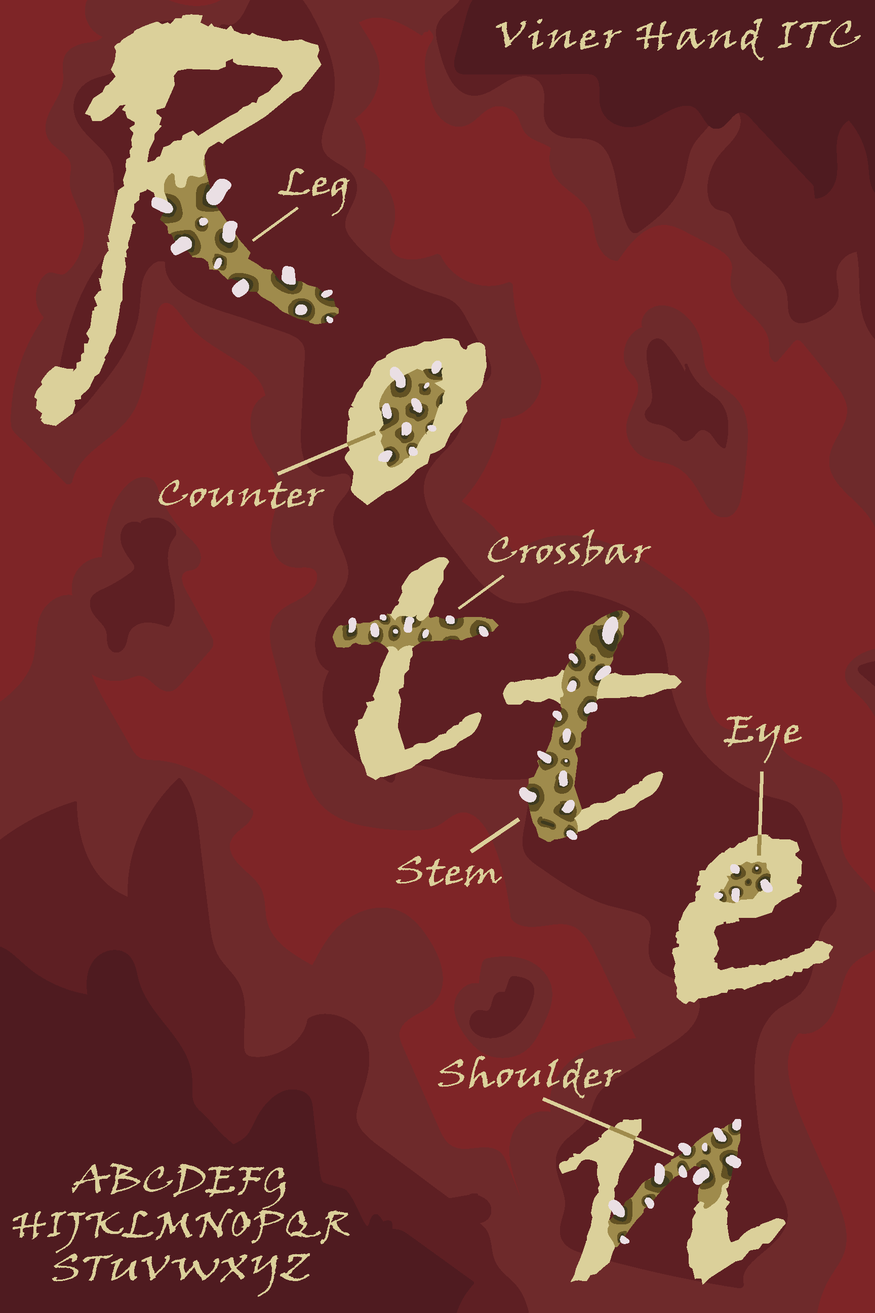
Rotten
Warning! Really gross!
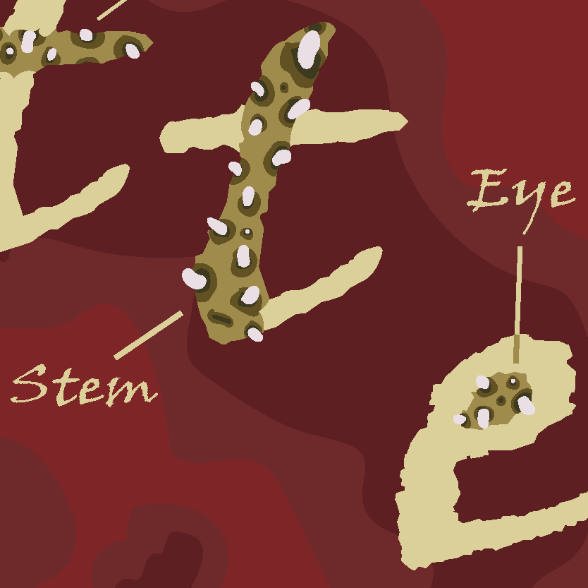
I used the word Rotten as the theme for my poster. I referenced a lot of images of rotting apples for the color palette and aesthetic. I used the font Viner Hand ITC, as written in the top right corner . For the highlighted sections of the letters to show the anatomy I imitated an even deeper rot, and had little worms in holes stick out of them using a pink colour so they could stand out.